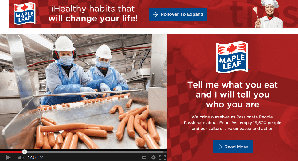
Corporate Digital Rebrand.
Discovery.
Maple Leaf engaged Majestic to completely re-articulate their vision for their corporate online presence. The focus needed to bring a customer-first approach to how stakeholders were to experience not only the site content, but the newly re-imagined Maple Leaf Foods brand.
Colours.
40% of White Space
40% Primary Colour Palette
20% Secondary Colour Palette
Fonts.
Simple And Clean.

MONSERRAT
BOLD
MEDIUM
REGULAR
ARIAL
BOLD
REGULAR
Inspired Design.
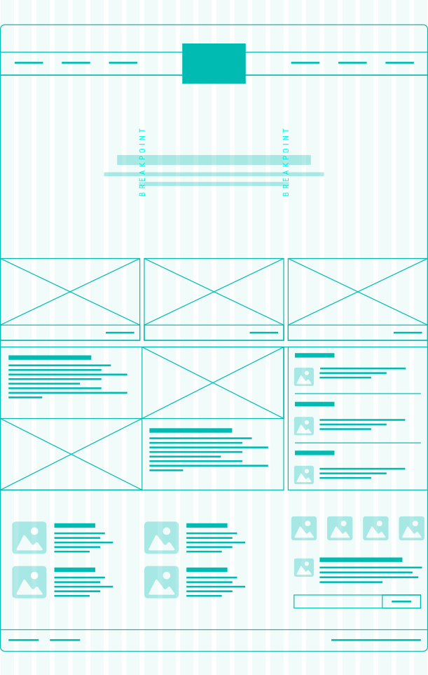
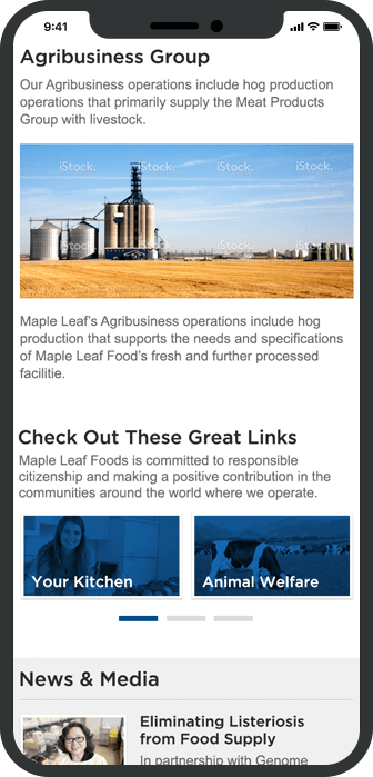
Core assets of the company, food and people, were given priority in the new design.
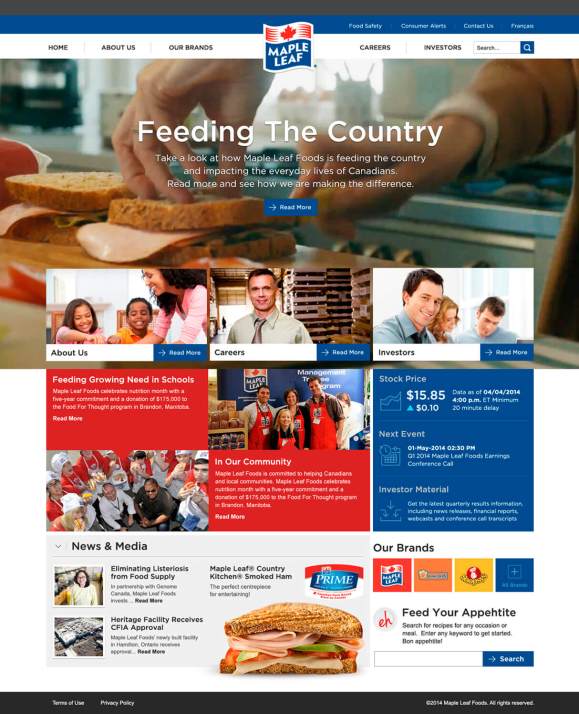
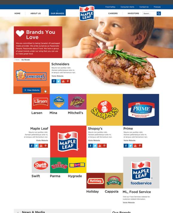
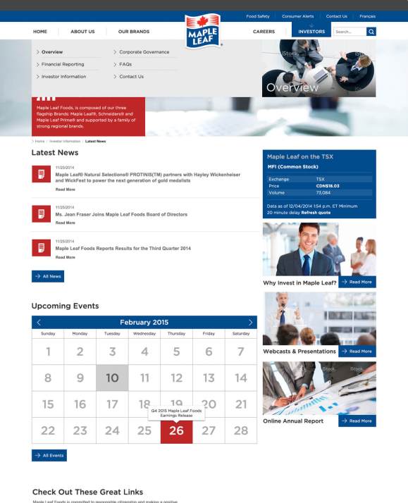
Responsive Design.
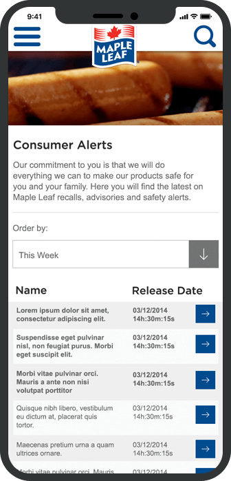
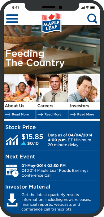
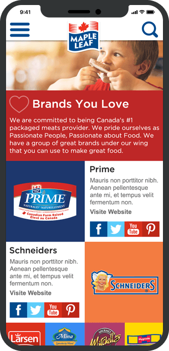
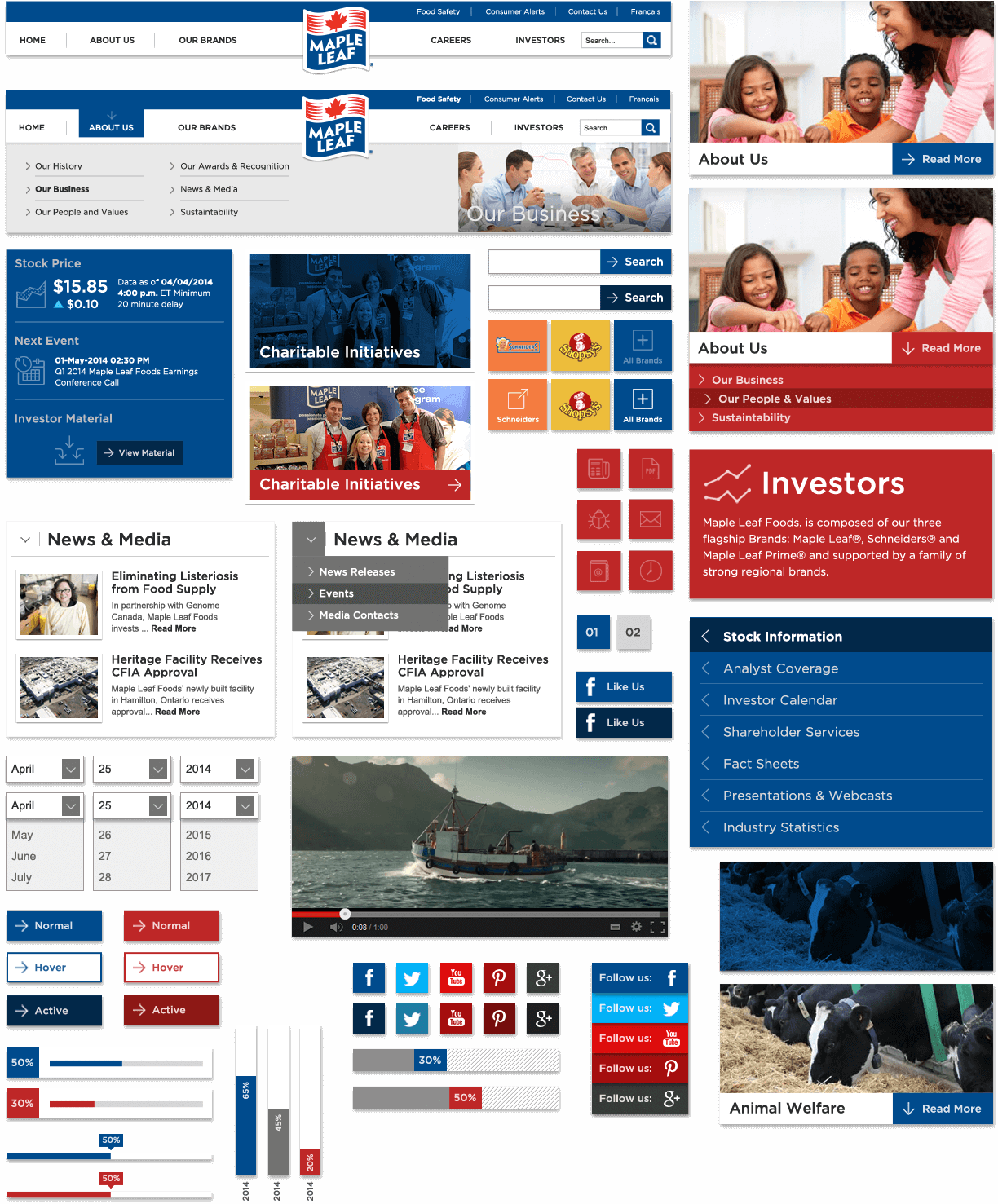
ELEMENTAL UI.
For effortless browsing and navigation, user interface elements are consistent in their placing and meaning.
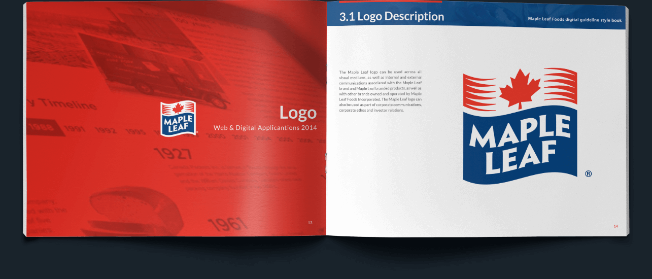
We created a 90 page digital branding guideline covering all digital aspects for Maple Leaf Foods.
The Delicious
Results.
- Consistent/simplified experience.
- Internal benchmarks exceeded.
- Time spent +35% in 6 months post launch.
- Pages viewed +52% in 6 months post launch.
- Renewed internal sense of pride around refreshed online presence.
View More Cases
New Corporate presence.

New Corporate
Learn More 

New Corporate
presence.
Learn More 
A brand from scratch.

A brand from
Learn More 

A brand from
scratch.
Learn More 
Building a hockey community.

Building a hockey
Learn More 

Building a hockey
community.
Learn More 


