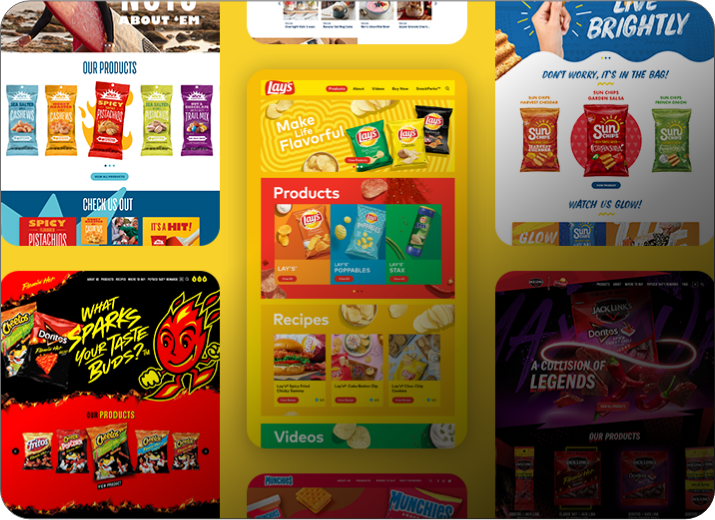
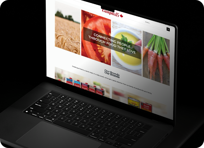
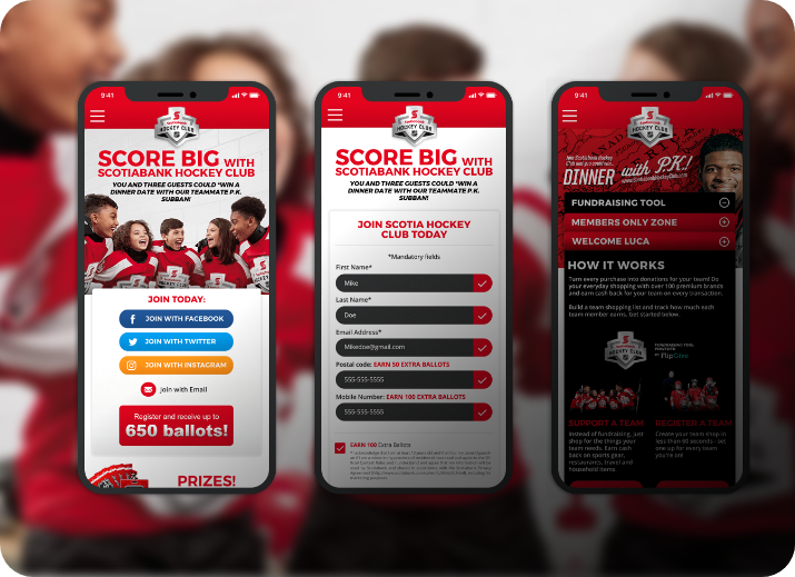
New
Presence
Weston Foods wanted to make it clear: food is at the centre of their conversation with consumers. Majestic was brought onboard to articulate this brand truth, and redevelop the company’s online presence through a newly defined, food-first lens.
Responsive
Mobile First

Elemental UX
To guide visitors through site content, we created an easy-to-use parallax interface to engage, inform and educate our audience.
- Conceptual wire-framing
- Responsive design
- Compliant brand presence: AODA/ADA, CAN-SPAM-CASL
Grid System

Colours
60% of White Space
40% Primary Colour Palette
Navy
Tangerine
Blue
Cream
Fonts
Brand Typeface
Knockout Welteweight

Open Sans
Light
Regular
Semibold
Bold
Inspired Design
The updated presence featured clean design, and bold imagery of food and Weston’s people, to connect visitors with the spirit of the brand.
- Food-first photography
- Clean backgrounds to let food imagery pop from the page
- Effective use of white/negative space
- Engaging parallax transitions


Elemental UI
For effortless browsing and navigation, user interface elements are consistent in their placing and meaning.


The results were delicious
- Satisfaction for Weston’s executive team
- Alignment with Weston’s marketing, branding, communications and IT needs
- Plug-and-play solution Weston can update using internal teams
- Ongoing Majestic support
View More Cases

A flamin' hot
experience.
Learn More 
Building a hockey
community.
Learn More 
A brand
new city.
Learn More 