

User Experience Design
10 Best Practices

Design It
For Mobile
-
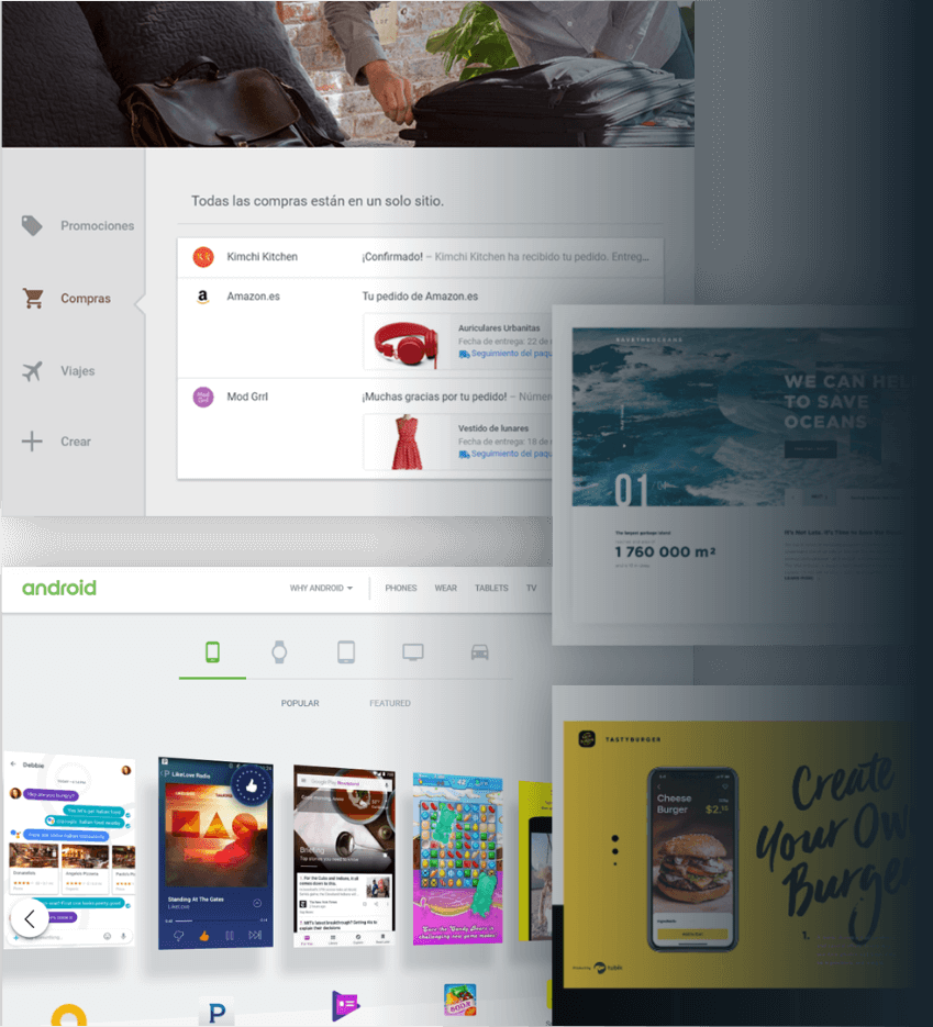
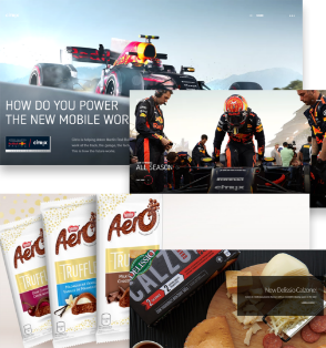
More than 53% of global website traffic is generated through mobile phones. In North America, 30% (and climbing) of mobile web users are mobile-only. Sites should be purpose-built for mobile screens.
-
Small screen sizes force ruthless decision-making: prioritizing the most important items down to the least yields a stronger UX overall.
-
Keep in mind capabilities unique to mobile: GPS, direct dial, gestures, others.
Keep
The Thumb Zone
In Mind


Use
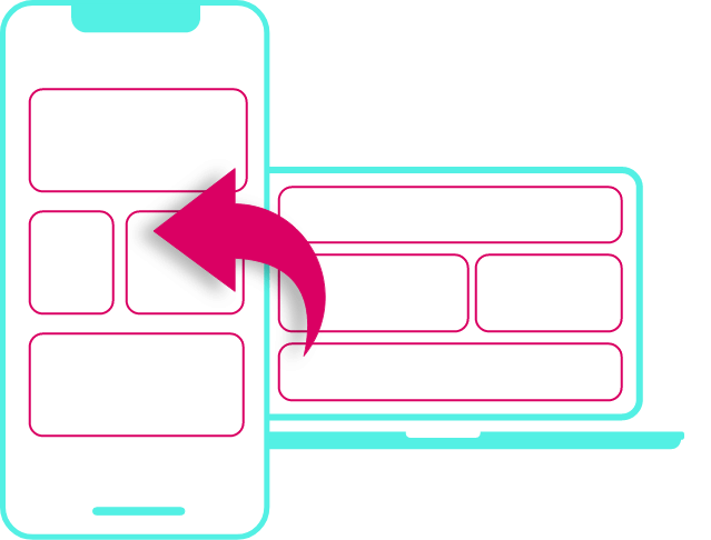
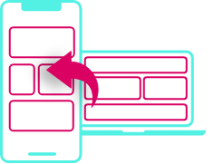
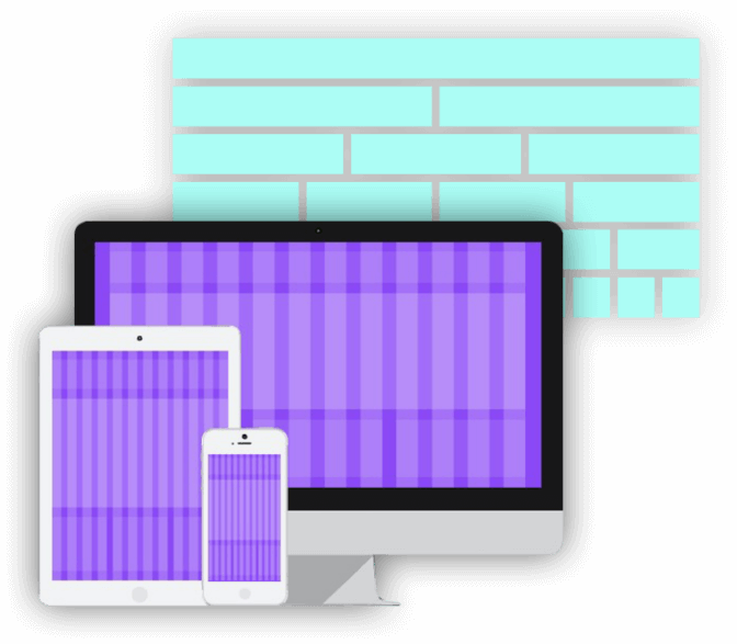
Responsive
Design
-
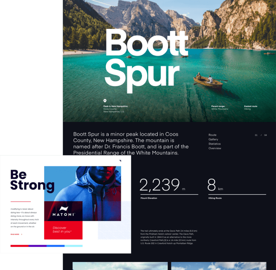
A website should trigger the same emotions and reactions on every screen. Responsive design maintains a consistent experience across all devices.
-
Second screen-ready.
-
Search engine-friendly.
-
Future-proof (vs. new hardware releases).


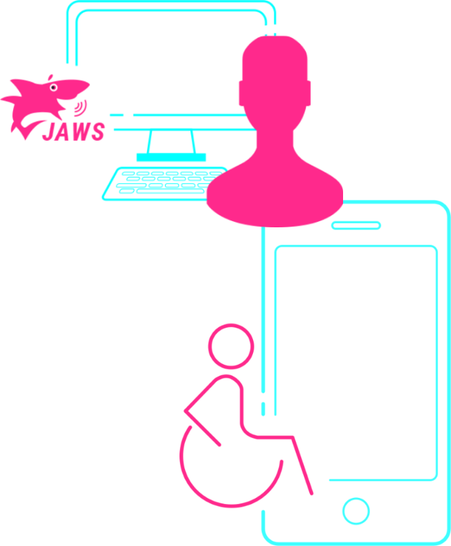

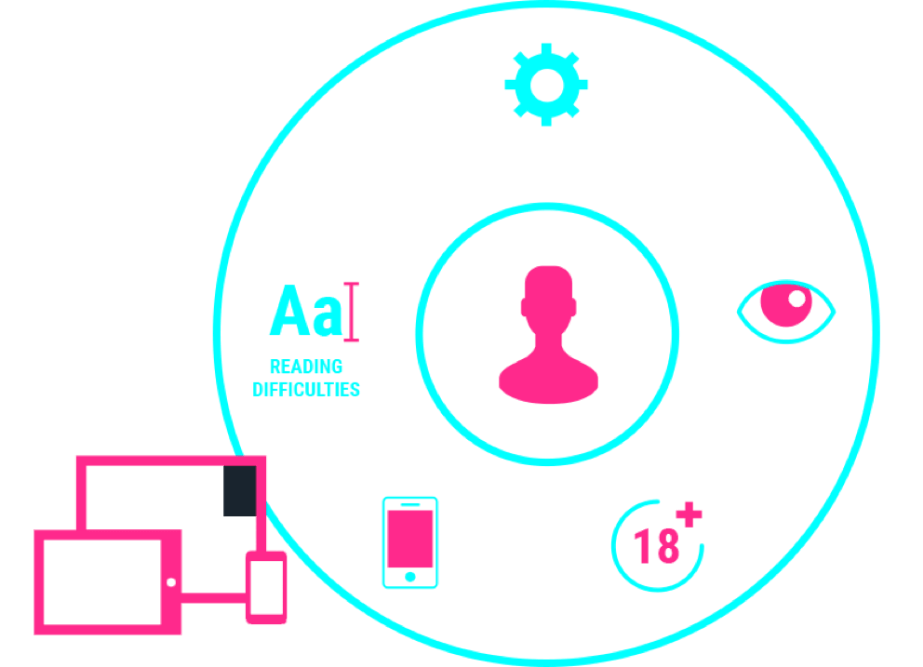
Accessibility
Matters
-
16% of North Americans have a disability.
-
Website accessibility is the law in many places in North America and Europe, including Ontario.
-
Many companies now design to WCAG 2.1 AA.
-
70% of customers will leave a website that doesn’t meet their accessibility needs.
-
Coding for accessibility standards also benefits abled users by mitigating noisy environments & screen glare.
-
Between disabled, aging and situational users, accessible design can improve user experiences (and conversion) for more than 40% of your online audiences.
-
Run a fast online verification here: https://achecker.ca/checker/.
-
Or you can ask the Government of Ontario if you are based in the province: https://www.aoda.ca/aoda-website-accessibility-audit.


Responsive
+ Accessible
= Conversion-Centric
-
Who the user is.
-
Where they are.
-
What device they are using.
-
Higher time spent on site.
-
Lower bounce rates.
-
Less user effort.
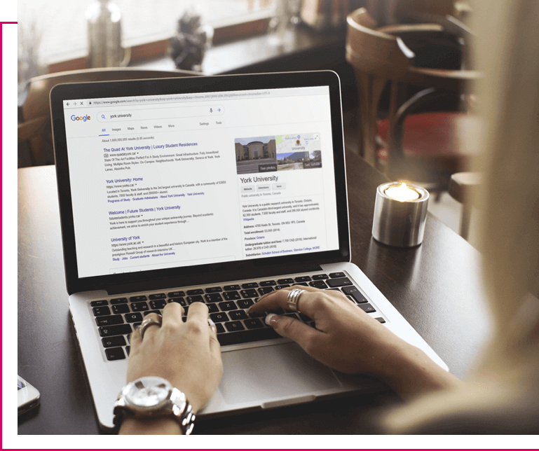
Robust
Site
Search
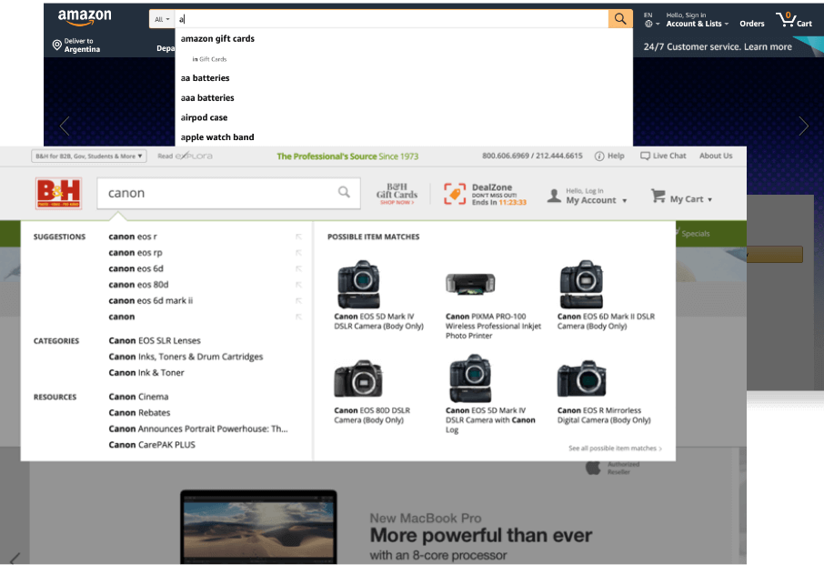
A robust site search makes information easily accessible for users.
There are several approaches to consider, and helps drive conversion.
-
Predictive Search (example - Google) enhances the UX by suggesting search terms as the user types. It decreases typing and allows users to reach information faster.
-
Filtered Search (example - Amazon) allows user multiple options for what or where to search for an item within the site.
-
Featured/Suggested Search (example - B & H Photo Video) highlights specific items across several categories, and can also include a variety of rich content, such as images.
Interaction
Design
A carefully-crafted and compelling interaction design enables users to have an enjoyable - and intuitive - site.
Done right, interaction design is a seamless surprise & delight experience.
-
Guided motion features gentle nudges, swipes, and animations as the user scrolls.
-
Parallax effects use multiple backgrounds which seem to move at different speeds to create a sensation of depth.

SEO
Ready
Creating SEO success for a website is a complex process that touches on every part of a site’s build: content creation, design and coding:
Organize content in clear silos:
-
Always consider headlines, tagline, body copy and keywords with a pages’s content.
-
Make sure all (or most) content is accessible within 2 cliks of the Higher placement in a site’s structure illustrates priority and importance.
-
Structure URLs in an obvious way to make it easy for search engines to index content.
-
Don't forget to create a complete and effective sitemap (and a 404 page).


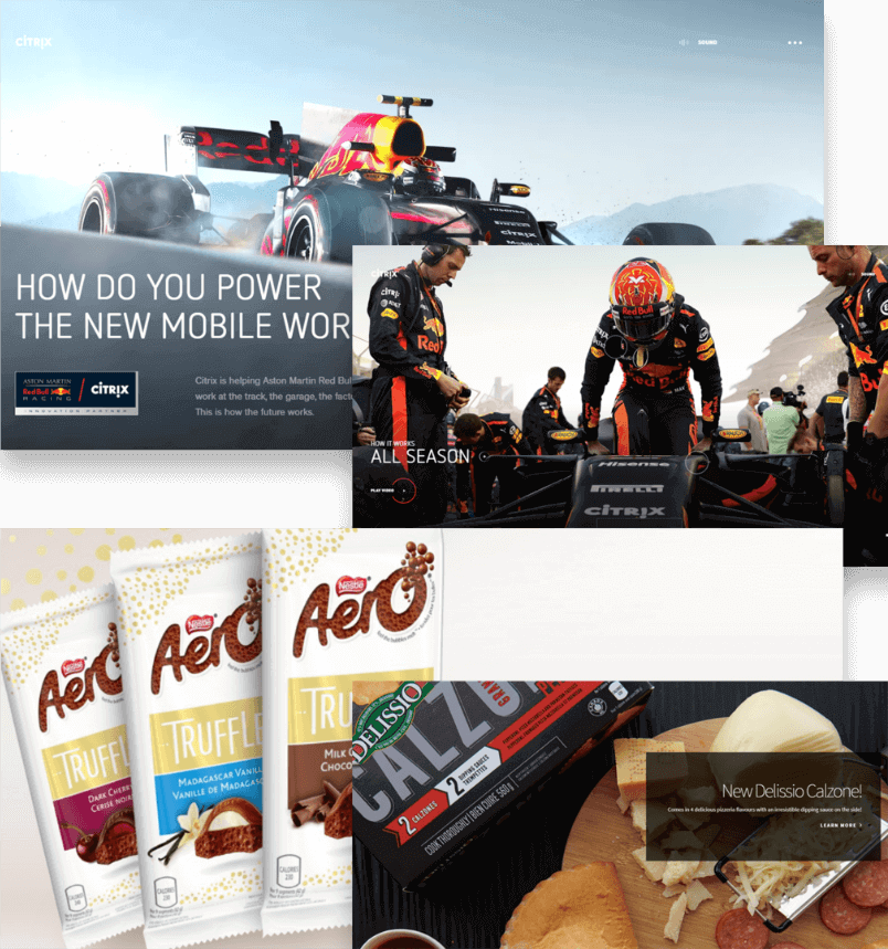
Large
Photography
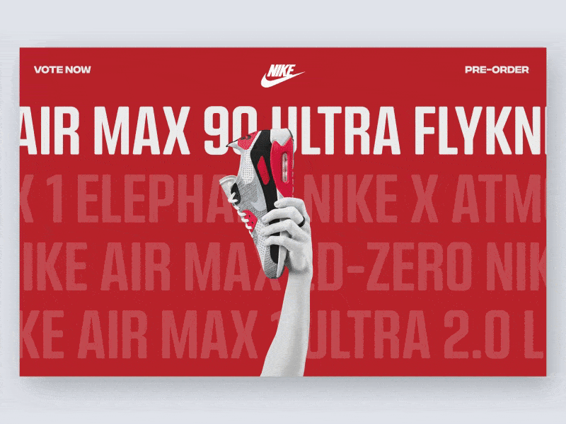
Large images, that take up most of the initial load area, are the biggest trend in site design over the past 2 years.
They create great visual impact.
Quality images are a must to pull this off properly.

Bold
Typography
& Copy
Typography should have a purpose and be scannable.
Users don’t want to read large blocks of copy. They want to get at the information they are looking for without having to spend more than a few seconds looking for it.
Copy should:
-
Be clear.
-
Guide users down the right path.
-
Be scannable.

Go easy
on carrousels
Although rotating image carousels (a.k.a. sliders) are a popular design device on many sites, they can hinder conversion.
-
Content delivered through carousels, although deemed important by site owners, is often missed by users, because of banner blindness: users often believe sliders look like ads, and have an aversion to clicking on them - often on content that is not first in the rotation.
-
Users can also be distracted by too much movement on the page - and annoyed when they sense losing perceived control of the user experience from images shifting automatically.
Much better to use a single image that features content of high importance - or even better, a video.
If you have any questions or need help with any digital projects please Contact Us.

